Walmart Pharmacy App
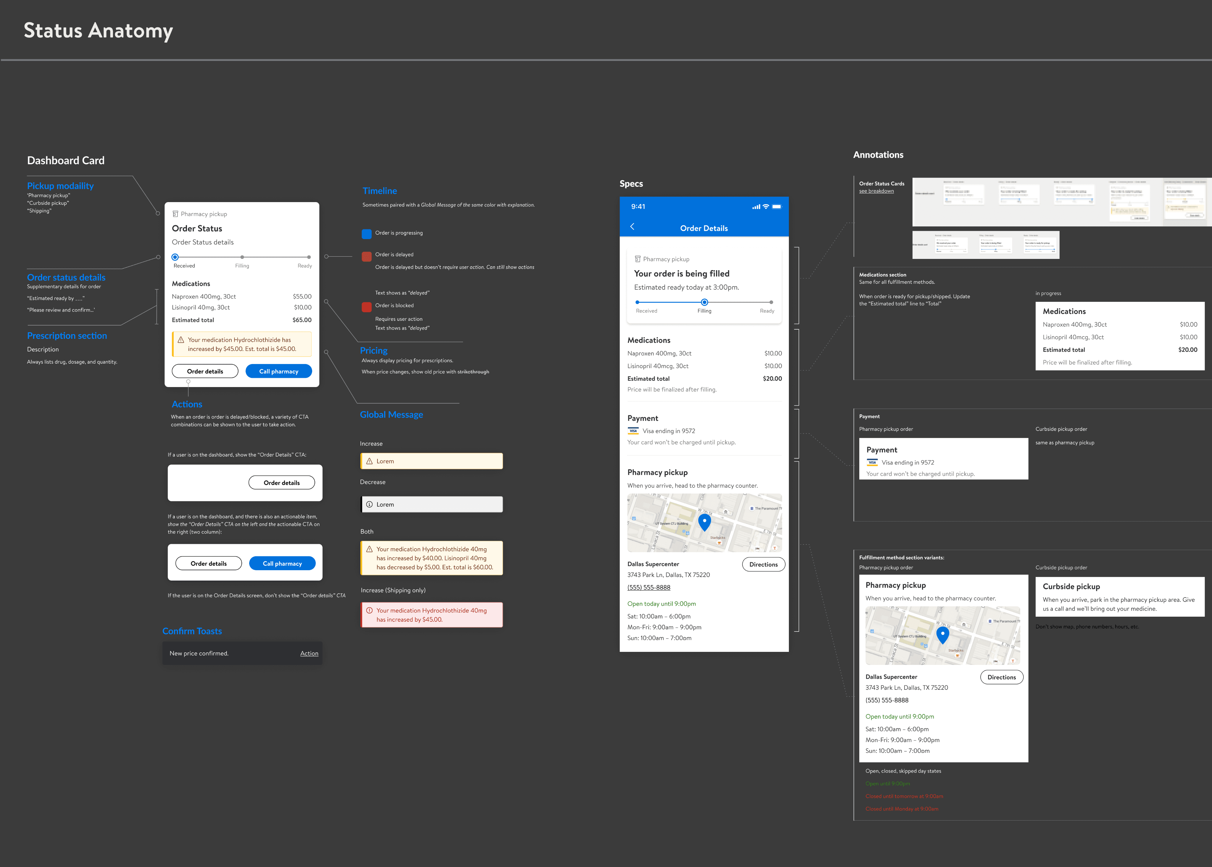
Walmart is the third largest pharmacy in USA. Connexus is Walmart Pharmacy’s in-house prescription filling software built to cater to its pharmacy business. It is used at its pharmacy stores by pharmacists and technicians in walmart store and sams club nationalwide.
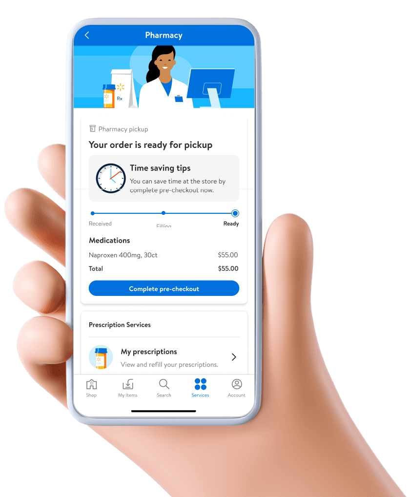
The application covers all the business processes involved in US pharmacy ranging from prescription drop-off to customer picks up the drugs, this include both mail orders and pharmacy pickup. Besides it also covers vaccinations appointment scheduling.
My Role
My Role
My Role
Timeline
Timeline
Timeline
Deliverable
Deliverable
Deliverable
Tool Used
Tool Used
Tool Used
Users
Users
Users
UX Designer i Researcher
3 Months
3 Months
3 Months
Wireframe & Sketch
Wireframe & Sketch
Wireframe & Sketch
Figma
Figma
Figma
Pharmacies & Technician
Problem
Problem
Problem
The current design is complicate and confusing, and long learning curve for new comers to be trained.
The design is visually looking very old and result in bad user experience.
Lack of Integration between Connexus and Walmart Health app
Lack of clear insurance verification process
Challenge
Challenge
Challenge
Extensive of information needs to displayed in small touch screen.
Very well understanding of Pharmacy process is required and it is technical and not easy to understand.
The users has been using this app for a long time. How do we design a new UI at the same time still accommodate the old users.
Design Process
Research
User interviews
Pharmancy process study
Consumer Research
Current product study
Analysis
Competitive Analysis
User Journey
ideation
Wireframe
Prototype
01 User interviews
01 User interviews
02 Pharmancy process study
04 User Journey
04 User Journey
03 Competitive Analysis
Wireframe
1
Click to expand search bar
2
Brief patient info, with Email / Call / Add notes buttons
3
Display current order, transfer or account issues need to be resolved
4
Recommendation for current offers/discount/product availability
5
Current Order: Edit icon to trigger editing state
reflection
irure dolor in reprehenderit in voluptate velit esse cillum dolore eu fugiat nulla pariatur. Excepteur sint occaecat cupidatat non proident, sunt in culpa qui officia deserunt mollit anim id est laborum.